Our client, a small oil and gas subsea company, desired a refreshed look for its 30-plus year company to stand out among the global competition as part of a new strategic partnership. The client expressed a desire to retain its name in the logo. Yet, they wished to remove the old tagline and stay with a blue and grey color palette, representative of its ocean environment and its pipeline integrity work.
Logo Refresh – Oil & Gas Company
SITUATION
Without original vector files, color scheme, typeface or brand book, Galvanized Strategies took on the task of presenting the client with possible color palettes and design ideas to give the logo a crisper appeal.
ORIGINAL LOGO
Upon review of the current logo in vector format, our graphics talent noticed that we needed to clean up what appeared to be hand-drawn typeface as evidenced by the ruler lines in the working draft below.
WORKING FIRST DRAFT
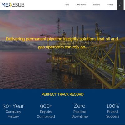
We discussed the first color palette, shown in the working draft version, with the idea of adding a third pop of color – a sunset yellow – to tie in the company’s oceanic working environment. The client supported adding a third color in the citrus spectrum to experiment with the brand identity.
FIRST ROUND OF REFRESHED LOGOS
Version No. 1 captured the essence of the client’s goal, with the darker blue and yellow setting the right tone. We were asked to identify a more blue-grey for the third color. Additionally, the yellow created a new issue with the “E” and the closest double line of the “X” looking somewhat like a house to the client.
We then separated the two letters, which then set a clear path for us to successfully and happily move forward with the refreshed horizontal logo and brand new vertical logo to be used for various online accounts seen below.
OUTCOMES
As desired, the oil and gas client achieved a fresh new look with a new color palette, defined typeface without the old tagline and a bolder brand feel to stand out from the global competition.
From this core branding, the client will receive its first brand standards book and online media kit as well as uniform social media branding, establishing a cohesive message and look and feel to communicate with buyers and trade media across all brand touchpoints.